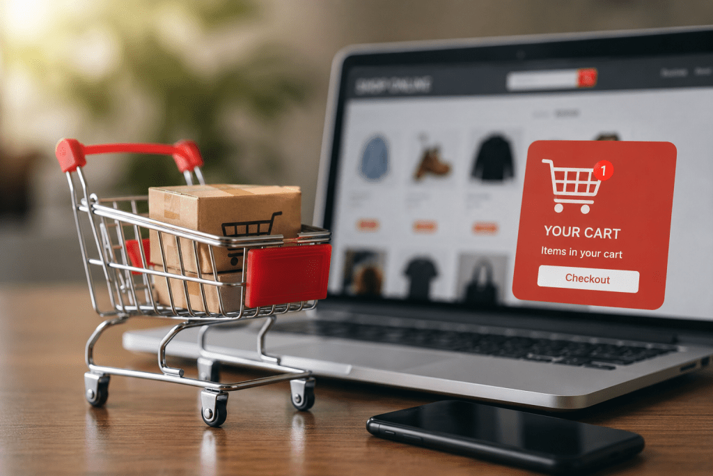
You spend weeks attracting visitors. You invest in ads, improve product pages, and even offer competitive prices. Customers browse your store, add products to their cart, and then… they disappear.
That moment hurts more than most store owners admit.
Industry research consistently shows that nearly 70% of online shopping carts are abandoned before purchase. The exact percentage varies by industry and device, but the pattern stays the same. Most businesses don’t lose sales because their products are bad. They lose them because the checkout experience creates unnecessary friction.
I’ve reviewed hundreds of ecommerce stores over the years, and the same problems appear again and again. Hidden fees, slow checkout pages, forced account creation, confusing payment options, and weak trust signals quietly push customers away.
The encouraging part? Most of these issues are completely fixable.
If you’re serious about checkout optimization, this guide walks through the biggest reasons customers leave and the practical improvements that can recover more completed purchases without increasing your advertising budget.
Cart Abandonment Statistics
Before changing your checkout, it’s worth understanding what the numbers actually tell us.
Recent ecommerce studies consistently report:
| Statistic | Why It Matters |
| Around 70% of shopping carts are abandoned | Most visitors never finish checkout. |
| Mobile shoppers abandon carts more often than desktop users | Mobile checkout experience has a huge impact on revenue. |
| Unexpected costs remain one of the leading cart abandonment reasons | Pricing transparency builds confidence. |
| Complicated checkout flows significantly reduce conversions | Every unnecessary step creates another exit point. |
These numbers reveal an important truth.
Your checkout isn’t just a payment page.
It’s the final sales conversation between your store and your customer.
Every extra click, every confusing field, and every moment of hesitation gives shoppers another opportunity to leave.
Why Customers Leave Before Buying
Understanding cart abandonment reasons is much more valuable than guessing.
Here are the most common problems I see during checkout audits.
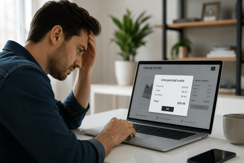
Unexpected Costs
Few things frustrate shoppers more than discovering additional charges at the last moment.
Shipping fees, taxes, handling charges, or surprise service costs instantly change the value they expected.
Many customers simply close the tab instead of completing the purchase.
Displaying estimated shipping costs earlier in the buying journey creates transparency and reduces last-minute surprises.
Forced Account Creation
People want convenience.
If someone has already decided to purchase, asking them to create an account before paying feels like unnecessary work.
Guest checkout removes friction and keeps momentum moving toward the purchase.
You can always invite customers to create an account after the order is complete.
Complicated Checkout UX
A poor checkout UX often includes:
- Too many form fields
- Unclear error messages
- Long loading times
- Difficult navigation
- Confusing layouts
Every additional obstacle increases the chance that customers rethink their decision.
Simple interfaces almost always outperform complex ones.
Limited Payment Options
Customers have preferred ways to pay.
If their preferred payment method isn’t available, many won’t switch.
Offering multiple secure payment options improves flexibility while reducing payment friction, especially for international customers and mobile shoppers.
Checkout UX Mistakes That Quietly Kill Conversions
Many businesses focus on product pages, discounts, and advertising while ignoring the last step of the buying journey. Ironically, that’s where revenue is often lost.
A smooth ecommerce checkout flow should feel effortless. Customers should never stop to figure out what to do next.
Here are the mistakes I encounter most often.
Asking for Too Much Information
Does a customer really need to enter their company name, fax number, or hear about your favorite marketing campaign before placing an order?
Probably not.
Only request information that’s essential to process the purchase. Every extra field adds friction and increases the likelihood of abandonment.
Weak Progress Indicators
Customers like knowing how close they are to finishing.
A simple progress bar or clearly labeled checkout steps reduces uncertainty and encourages users to complete the purchase.
Slow Loading Pages
Patience disappears quickly during checkout.
Even a few seconds of delay can make shoppers question whether the payment went through or if the website is trustworthy. Compress images, optimize scripts, and keep checkout pages lightweight for faster performance.
Poor Error Handling
Nothing is more frustrating than submitting a form only to see a vague message saying, “Something went wrong.”
Instead, highlight the exact field with the issue and explain how to fix it immediately. Helpful error messages keep customers moving instead of giving up.
Distracting the Buyer
Checkout isn’t the place for popups, unrelated promotions, or aggressive upselling.
Once someone reaches this stage, the goal is simple: help them complete the purchase with as few distractions as possible.
Trust Signals That Increase Buyer Confidence
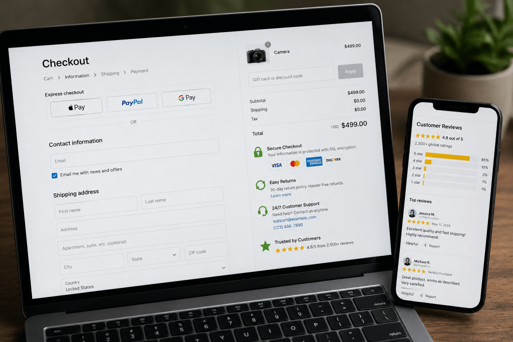
Trust is one of the biggest factors influencing purchase decisions.
Customers are sharing payment information and personal details. If anything feels suspicious, they’ll leave without thinking twice.
Here are the trust signals that consistently improve checkout process optimization.
Display Security Badges
Visible SSL certificates, secure payment icons, and trusted security seals reassure customers that their information is protected.
Avoid cluttering the page with dozens of badges. A few recognizable trust indicators are enough.
Show Clear Return and Refund Policies
People buy more confidently when they know they aren’t taking unnecessary risks.
Place return policy links near the checkout summary instead of hiding them in the website footer.
Make Contact Information Easy to Find
A visible customer support email, phone number, or live chat option tells shoppers that real people are available if something goes wrong.
That reassurance often makes the difference between hesitation and purchase.
Include Genuine Customer Reviews
Short product ratings or verified buyer reviews near checkout reinforce confidence without distracting from the payment process.
Authenticity matters far more than quantity.
Improve the Payment Experience
The payment stage should feel fast, secure, and flexible.
Customers shouldn’t have to search for their preferred payment option or wonder whether their transaction is safe.
Here’s how I recommend improving the payment experience.
Offer Multiple Payment Methods
Different customers prefer different payment options.
Support commonly used methods such as:
- Credit and debit cards
- Digital wallets
- Buy Now, Pay Later services
- Bank transfers where appropriate
More payment choices mean less payment friction and higher conversion potential.
Keep Payment Errors Clear
Declined payments happen.
Instead of showing a generic failure message, explain the issue and suggest practical next steps, such as trying another payment method or checking card details.
Clear guidance reduces frustration and prevents unnecessary drop-offs.
Save Payment Details Securely
For returning customers, securely saved payment information can significantly speed up future purchases while improving the overall shopping experience.
Always follow applicable payment security standards and privacy regulations.
Optimize Mobile Checkout for Today’s Shoppers
More than half of ecommerce traffic now comes from smartphones, yet many stores still design checkout experiences primarily for desktop users.
That’s a costly mistake.
A mobile checkout should prioritize speed, simplicity, and readability.
Here are a few improvements that consistently make a difference:
Use large, easy-to-tap buttons.
- Enable autofill for customer information.
- Support mobile wallets for faster payments.
- Minimize typing wherever possible.
- Keep forms short and visually clean.
- Avoid unnecessary redirects during payment.
Every tap matters on a small screen.
If completing a purchase feels like work, customers will simply move on to another store.
One Page Checkout: Is It Always Better?
One page checkout has become a popular recommendation, but it isn’t automatically the best solution for every store.
The goal isn’t to reduce the number of pages. It’s to reduce the amount of effort required to complete a purchase.
A well-designed one page checkout works best when it stays clean, organized, and easy to scan. If every field, payment method, shipping option, coupon box, and upsell is squeezed onto a single page, customers can feel overwhelmed instead of helped.
For many ecommerce brands, a streamlined one page checkout offers several advantages:
- Faster purchase completion
- Fewer clicks
- Better mobile usability
- Lower checkout abandonment
- Improved conversion rates
That said, stores with highly customizable products or complex shipping requirements may benefit from a simple multi-step checkout that clearly separates shipping, billing, and payment information.
The best approach is to test both experiences instead of assuming one will outperform the other.
Ultimately, successful checkout optimization is driven by customer behavior, not trends.
Checkout Optimization Checklist
Before investing more money in advertising, review your checkout against this checklist.
| Checklist Item | Status |
| Display all costs before checkout | □ |
| Offer guest checkout | □ |
| Keep forms short and simple | □ |
| Show recognizable trust badges | □ |
| Provide multiple payment methods | □ |
| Optimize for mobile devices | □ |
| Improve page loading speed | □ |
| Display clear error messages | □ |
| Use a visible progress indicator | □ |
| Test checkout regularly with real users | □ |
If you can’t confidently check every box, there’s room to improve your checkout process optimization.
Even small improvements often produce measurable gains in completed orders.
Why Do People Abandon Carts?
Customers rarely abandon their carts because they suddenly stop wanting the product. More often, something during checkout interrupts their buying momentum.
The most common cart abandonment reasons include unexpected shipping costs, lengthy checkout forms, mandatory account creation, slow-loading pages, limited payment methods, security concerns, and a poor mobile experience. Even small inconveniences can create enough hesitation for shoppers to leave.
If you’re seeing a high abandonment rate, reviewing your checkout UX is usually the best place to start.
How to Reduce Checkout Drop Off?
Reducing checkout drop off starts with removing friction at every step of the buying journey.
Here are the improvements that consistently deliver results:
- Enable guest checkout.
- Display all costs before checkout.
- Minimize unnecessary form fields.
- Improve page speed.
- Offer multiple secure payment options.
- Optimize the checkout for mobile users.
- Show trust badges and clear return policies.
- Use autofill wherever possible.
- Regularly test your ecommerce checkout flow with real customers.
Small improvements often combine to produce significant gains in conversion rate.
What Is Best Checkout Design?
The best checkout design is simple, intuitive, and focused on completing the purchase.
A high-converting checkout typically includes:
- Clean, distraction-free layout
- Clear progress indicators
- Large, easy-to-click buttons
- Minimal form fields
- Mobile-first responsiveness
- Transparent pricing
- Visible trust signals
- Fast page loading
- Multiple payment methods
Successful checkout optimization isn’t about adding more features. It’s about making every step easier for the customer.
How to Improve Payment Process?
A seamless payment experience removes the final barrier between intent and purchase.
You can improve the payment process by:
- Supporting popular payment methods and digital wallets.
- Reducing unnecessary redirects.
- Displaying secure payment badges.
- Providing clear payment error messages.
- Allowing customers to save payment details securely for future purchases.
- Optimizing payment pages for mobile devices.
Reducing payment friction creates a faster checkout experience and encourages more shoppers to complete their orders.
Read Also:- Category Page SEO Secrets: Why 90% of Ecommerce Stores Fail Here
Final Thoughts
Every abandoned cart represents a customer who was interested enough to begin the buying process. Most didn’t leave because they changed their mind. They left because something during checkout created doubt, frustration, or unnecessary effort.
That’s why checkout optimization deserves the same attention as product pages, SEO, or paid advertising. A faster, simpler, and more trustworthy checkout experience can increase conversions without requiring additional traffic.
I’ve seen businesses make surprisingly small improvements, such as simplifying forms, adding guest checkout, improving mobile usability, or expanding payment options, and recover revenue they didn’t realize they were losing.
If your checkout hasn’t been reviewed in months, now is the right time.
Request Checkout Review
Wondering where customers are dropping off in your checkout journey?
Our team at Webiators performs detailed checkout audits to identify friction points, improve the customer experience, and increase completed purchases. Whether you need expert CRO Services to boost conversions or tailored Shopify Development to create a faster, high-converting checkout, we’ll help you build a buying experience that turns more visitors into loyal customers.
Request your Checkout Review today and start converting more carts into completed sales.
FAQs
Does guest checkout help?
Yes. Guest checkout removes a major barrier in the buying journey by allowing customers to purchase without creating an account. This reduces checkout friction, speeds up the process, and often leads to higher conversion rates.
Do trust badges increase sales?
Trust badges don’t guarantee more sales on their own, but they strengthen customer confidence. When combined with secure payment options, transparent policies, and a professional checkout experience, they can help reduce cart abandonment.
One page checkout vs multi-step: Which is better?
It depends on your store. One page checkout works well for simple purchases, while a multi-step checkout is often better for stores with complex products or shipping requirements. Testing both is the best way to find what converts better.
What causes cart abandonment?
The most common causes include unexpected costs, forced account creation, lengthy checkout forms, limited payment options, slow-loading pages, and a poor mobile checkout experience. Improving these areas is key to effective checkout optimization.