In the fast-paced world of online shopping, you have about three seconds to convince a visitor to stay. If your website feels like a digital maze, those visitors aren’t just leaving; they’re sprinting toward your competitors.
While many brands focus solely on getting traffic through ecommerce marketing services, the real magic happens once the user lands on the page. That is where ecommerce UX design and UI step into the spotlight. Let’s talk about why the “look and feel” of your store is actually your most hardworking salesperson.
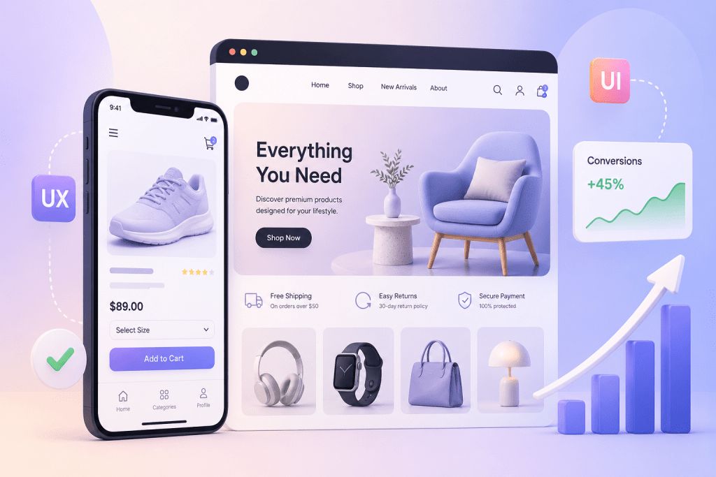
UX vs UI: The Brain and the Beauty
Before we dive into the “why,” let’s clear up the “what.”
- UX (User Experience): It is the logical side. Is the navigation easy? Does the checkout process make sense? UX is about making the journey from “Just Browsing” to “Order Confirmed” as frictionless as possible.
- UI (User Interface): It is the visual side. It’s the buttons, the color palette, the typography, and the high-quality imagery. UI is what makes your brand look trustworthy and professional.
When you invest in conversion design, you are marrying these two concepts to guide a user’s hand toward the “Buy Now” button.
Importance of Ecommerce UI and UX Designs
1. Building Instant Trust
In the physical world, if a shop has peeling paint and dim lighting, you’d probably keep walking. The same applies to your digital storefront. A polished ecommerce UI tells the customer, “We are a legitimate business.”
Modern shoppers are savvy. If a site looks outdated or the buttons don’t respond correctly, they worry about the safety of their credit card data. Professional Ecommerce development services ensure that your UI reflects modern standards, which immediately lowers the customer’s “defensive wall.”
Did you know that a one-second delay in page load time can lead to a 7% drop in conversions? That is where ecommerce UX design becomes a technical necessity. It’s not just about speed, though. It’s about “Information Architecture.”
Can a user find what they need in two clicks? If they have to hunt through a messy menu to find your shipping policy or a specific product category, you’ve already lost them. Effective UX design organizes your catalog so that the path to purchase is a straight line, not a zigzag.
3. The Power of “Mobile-First”
Most global shoppers are scrolling on their phones during their commute or while watching TV. If your site isn’t optimized for mobile, you’re essentially closing your doors to 60% of your market. A good conversion-based design of your website ensures that buttons are “thumb-friendly,” images are responsive, and forms are easy to fill out on a small screen.
How Webiators Technologies Can Help
Designing a high-converting store is a complex puzzle, but you don’t have to solve it alone. Webiators Technologies specializes in turning browsers into buyers. Whether you are looking for top-tier Adobe Commerce website development services or need a complete overhaul of your current platform, Webiators blends technical expertise with creative flair.
- Custom UX/UI: We don’t do “cookie-cutter.” We build interfaces tailored to your specific audience.
- End-to-End Solutions: From initial development to long-term marketing services, we ensure your brand remains visible and profitable.
By focusing on the subtle psychology of user behavior, Webiators ensures that your website isn’t just a gallery of products, but a conversion engine.
Also Read – Top 7 Reasons to Choose Adobe Commerce for Your Online Store in 2026
Examples of the Best and the Worst UI/UX of the US Ecommerce Brands
To give you a clearer picture of how these concepts play out in the real world, let’s look at how some major US brands handle their digital storefronts. The difference between a sale and a bounce often comes down to these specific design choices.
The Gold Standard: Lessons from Best-in-Class US Brands
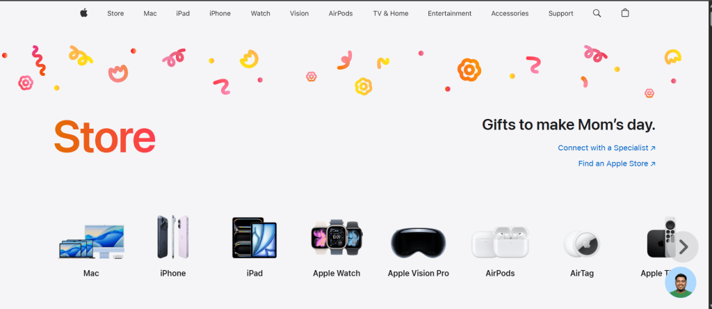
When you look at industry leaders like Apple or Airbnb, their success isn’t just in their products, but in their ecommerce UI. They utilize a “minimalist” approach that removes distractions.
Apple: Their site is a masterclass in conversion design. They use massive amounts of white space, high-definition product imagery, and very little text. The “Buy” button is always a high-contrast color that stands out against the background.
Where it Goes Wrong: Common UI/UX Pitfalls
On the other hand, even massive retailers can sometimes struggle with “clutter.” A famous example often cited by designers is the older versions of eBay or regional grocery chains.
- The “Wall of Content”: When a brand tries to put every sale, every category, and every newsletter pop-up on the home page at once, it creates a “visual noise.” If a user feels overwhelmed, their brain naturally wants to close the tab.
- Hidden Navigation: Some sites try to be too “creative” and hide the menu behind strange icons. If a shopper has to play a game of hide-and-seek to find the “Contact Us” or “Shipping Info” page, they will lose trust in your ecommerce development services.
Final Thought
Your ecommerce store is your most valuable asset. Don’t let a “clunky” design hold your business back. Invest in professional ecommerce UX design today and watch your conversion rates soar!
FAQs
1. What is the most important part of ecommerce UX design?
The checkout process. If your checkout is long, requires forced account creation, or has hidden shipping costs, people will abandon their carts.
2. How does UI affect my marketing?
Better UI leads to a lower bounce rate. When your marketing services drive traffic to a beautiful site, visitors stay longer, which improves your SEO and ROI.
3. Is Adobe Commerce good for UX?
Absolutely. An Adobe Commerce website development offers incredible flexibility, allowing for highly customized, fast-loading, and secure user experiences.
4. What is “Conversion Design”?
It is a design strategy specifically aimed at nudging users toward a goal, such as signing up for a newsletter or completing a purchase, using visual cues and psychological triggers.
5. Should I focus on UX or UI first?
They happen together! However, a pretty site (UI) that doesn’t work (UX) is useless. Start with a solid functional foundation and wrap it in a stunning visual layer.